Tact Design

TOPO MOBILE-1
TOPO DESKTOP-1

Cliente:
Frutagel
Agência:
Tact Design
JOB:
Criação de nome, logo e arte para embalagem para cones de sorvete

DESCRIÇÃO:

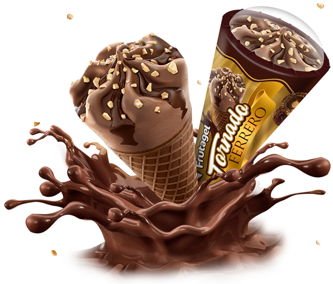
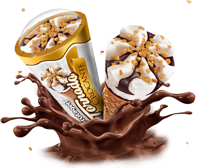
O desafio para a nova embalagem do cone era dar um nome para a linha dos cones da Frutagel, o nome escolhido o Tornado que faz referência direta ao formato do cone e gera uma diferenciação da linha em relação a outros do mercado. Assim criamos a nova marca, e também a arte da embalagem destacando bem a marca, sabores e cores e nome dos produtos. Foram feitos 2 sabores sendo o Ferrero e Crocante. Feito para de destacar no papal metalizado, algumas áreas tem ficam brilhantes destacando o metalizado destacando muito o produto final no ponto de venda.

DESCRIPTION:

The challenge for the new cone packaging was to name the Frutagel line of cones, the name chosen the Tornado, which makes direct reference to the shape of the cone and generates a differentiation of the line in relation to others on the market. So we created the new brand, and also the packaging art, highlighting the brand, flavors and colors and the name of the products. 2 flavors were made, Ferrero and Crispy. Made to stand out on the metallic paper, some areas are shiny highlighting the metallic highlighting the final product at the point of sale.

NOME + LOGO

Definido o nome Tornado, foi feito a nova logo, com fonte grossa com estilo mais clássico em branco para destacar bem no ponto de venda e contornos dourados e marrons que além de dar uma sensação de valor maior, faz referência direta as cores do produto.

Once the Tornado name was defined, the new logo was created, with a thick font with a more classic style in white to highlight well at the point of sale and golden and brown contours that, in addition to giving a feeling of greater value, makes direct reference to the colors of the product.

A cor da logo da Frutagel Sorvetes que na sua versão original é branca e verde, para melhor se adaptar a esta linha, a cor dela foi adaptada para o branco e contornos marrons. Isso fez com que além de manter a seu padrão visual ficou mais harmônico com a embalegem.

The color of the Frutagel Sorvetes logo, which in its original version is white and green, to better adapt to this line, its color was adapted to white and brown contours. This meant that, in addition to maintaining its visual pattern, it became more harmonious with the packaging.


Inspirada no famoso bombom Ferrero Rocher, esse sabor é uma delícia e só de ver a embalagem já da vontade de devorá-lo. Para a embalagem Cone Tornado da Frutagel, usamos cores e elementos de identidade visual para lembrar a marca do Ferrero Rocher, elementos como a faixa dourada, o marrom do chocolate, imagens dos bombons e tudo isso criando uma arte totalmente nova inspirada na marca original e ainda com uma impressão em papel metalizado com brilho metálico nas áreas como no fundo e na faixa dá toda uma elegância e imponência para o produto.

Inspired by the famous Ferrero Rocher bonbon, this flavor is delicious and just seeing the packaging makes you want to devour it. For Frutagel’s Cone Tornado packaging, we used colors and visual identity elements to remember the Ferrero Rocher brand, elements such as the golden band, the chocolate brown, images of the chocolates and all this creating a totally new art inspired by the original brand and even with a print on metallic paper with a metallic shine in the areas such as the background and the band, it gives all the elegance and grandeur to the product.

Seguindo a mesma identidade visual da linha do Ferrero, o Cone Tornado Crocante também é de dar água na boca. Com imagens e cores bem chamativas e brilhantes, mantemos os mesmos elementos e só mudamos a cor do fundo e faixa superior para representar melhor o sabor e as cores do produto, no caso o branco do sorvete, marrom do chocolate e o dourado das castanhas e da identidade na linha. Também com uma impressão em papel metalizado com brilho metálico nas áreas como no fundo e na faixa ele se destaca no ponto de venda e é líder de vendas.

Following the same visual identity as the Ferrero line, Cone Tornado Crispy is also mouthwatering. With very striking and bright images and colors, we keep the same elements and only change the color of the background and upper band to better represent the flavor and colors of the product, in this case the white of the ice cream, the brown of the chocolate and the gold of the chestnuts and of the identity on the line. Also with a print on metallic paper with metallic luster in areas such as the background and the banner, it stands out at the point of sale and is a sales leader.